Pearson vs Spearman correlation: which one, and when (in R)
statistics
correlation
r-tutorial
Pearson measures linear association; Spearman measures monotonic association on ranks. A clear R example shows exactly when they disagree — and which to trust.
Author
Rverse Analytics
Published
June 15, 2026
Both quantify how two variables move together, but they answer subtly different questions. Choosing wrong can hide a strong relationship or overstate a fragile one. (Want a quick number and scatter plot? Use our correlation calculator.)
The difference in one sentence
Pearson measures the strength of a linear relationship, using the raw values.
Spearman measures the strength of a monotonic relationship, using the ranks — so it captures “as X goes up, Y goes up” even when the shape is curved, and it shrugs off outliers.
Where they disagree
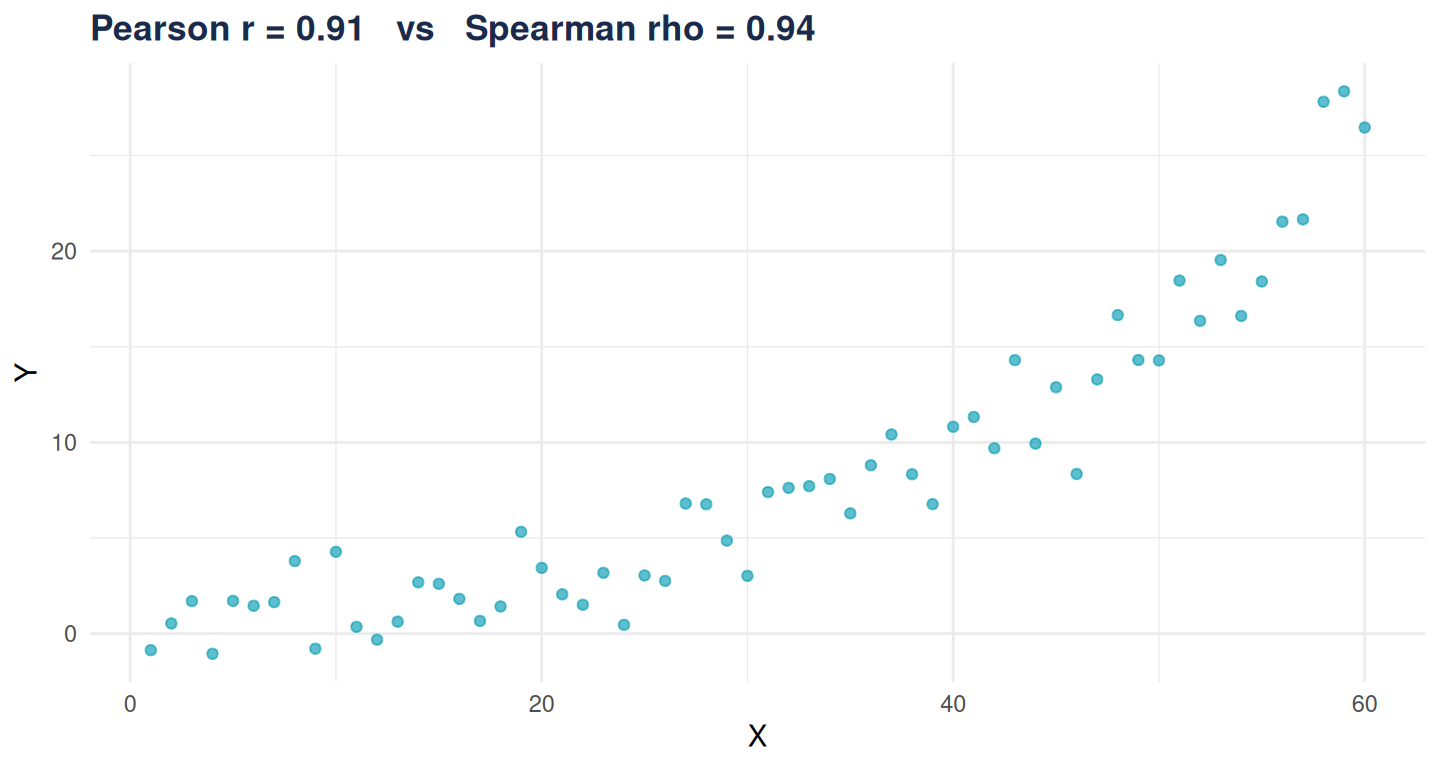
Take a strong but curved (exponential) relationship:
The relationship is essentially perfect and increasing, so Spearman is near 1. Pearson is lower because the relationship isn’t a straight line — it’s penalised for the curvature.
Getting the test
cor.test(x, y, method ="spearman")
    Spearman's rank correlation rho

data:  x and y
S = 2214, p-value < 2.2e-16
alternative hypothesis: true rho is not equal to 0
sample estimates:
      rho
0.9384829
cor.test() gives the coefficient, the test statistic and a p-value for either method.
How to choose
Pearson when the relationship looks linear and the data are roughly normal without wild outliers.
Spearman when the relationship is monotonic but curved, the data are ordinal, or outliers/skew are present.
Always plot first — a coefficient without a scatter plot hides curvature and outliers. And whichever you use: correlation is not causation.
Correlation is usually the opening question. For regression, confounder adjustment and a write-up, that’s our work.