Sensitivity, specificity, PPV and NPV in R — and why prevalence changes everything
clinical
biostatistics
diagnostics
Diagnostic accuracy from a 2×2 table in base R: sensitivity, specificity, predictive values and likelihood ratios — plus the reason the same test looks brilliant in one clinic and useless in another.
Author
Rverse Analytics
Published
July 6, 2026
When you evaluate a diagnostic or screening test, four numbers do most of the work — and two of them quietly depend on something the test can’t control: how common the disease is. Here’s the full calculation in base R, no packages required.
From a 2×2 table to the metrics
Start with the counts of test result against true disease status:
Sensitivity and specificity are properties of the test itself. PPV and NPV — the questions patients actually care about (“I tested positive, do I have it?”) — are not: they shift with prevalence. Likelihood ratios neatly combine sensitivity and specificity and feed directly into Bayesian updating of pre-test odds.
Watch prevalence move the predictive values
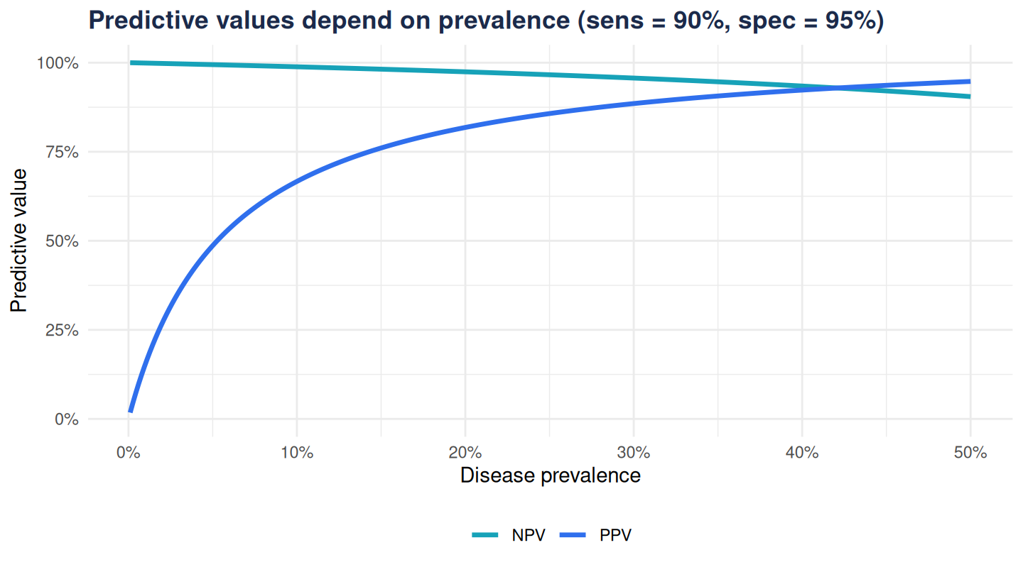
Hold sensitivity and specificity fixed and sweep prevalence from rare to common:
At 1% prevalence a “positive” from this excellent test is more likely to be a false alarm than a true case — the PPV is low even though sensitivity and specificity are high. Move to a specialist clinic where a third of patients truly have the disease and the same test’s PPV soars.
The takeaway
Quote sensitivity and specificity to describe the test; quote PPV and NPV with the prevalence they assume, or you’ll mislead. Better still, present predictive values across the plausible prevalence range — exactly what the diagnostic-test calculator in our live demos does interactively.